Yoinves - Online Reksa Dana
Brand Identity Brand Naming Digital DesignYour Journey to Financial Freedom–We had the privilege of working on the Yo! Invest project, an innovative leap in the world of digital investment platforms. Our mission was to design a brand identity and an entire user experience that would set Yo! Invest apart from its competitors.
Disclaimer: The portfolio featured in our business credential is a consolidation of The Council’s portfolio and the results of our professional experience at prominent brand consulting firms for more than 20 years, including Landor Associates, Interbrand, Whitespace, Inkara, and NuBrain Design.
Invoking Financial Action
The name "Yo! Invest" was born to inspire and motivate audiences to embark on their mutual fund investment journey. It's a modern, dynamic approach to making smart financial choices and achieving a better life.
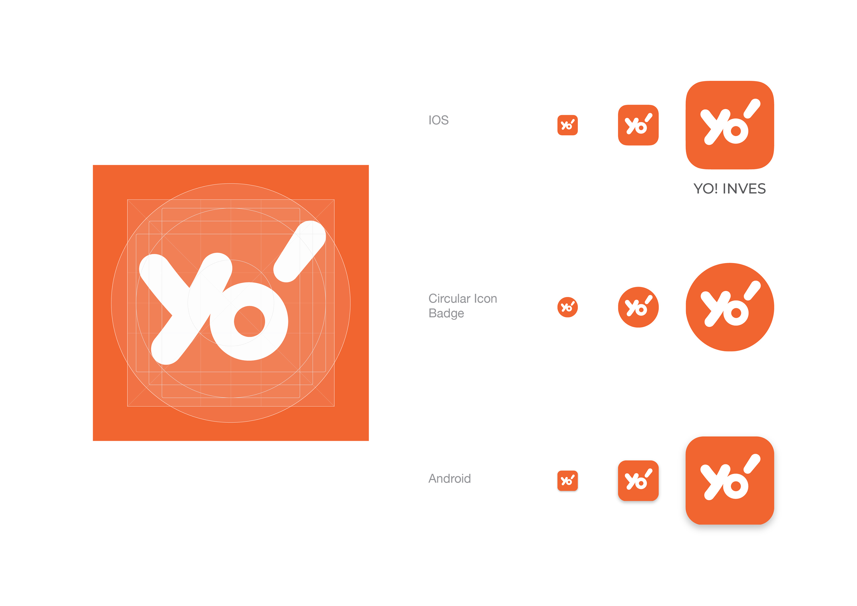
The Visual Language of Yo! Invest
Our visual identity for Yo! Invest, especially the "YO!" element in the logo, was carefully crafted to be unique and attention-grabbing. The exclamation-like mark within the 'O' gives Yo! Invest a distinct visual edge in the competitive investment market.
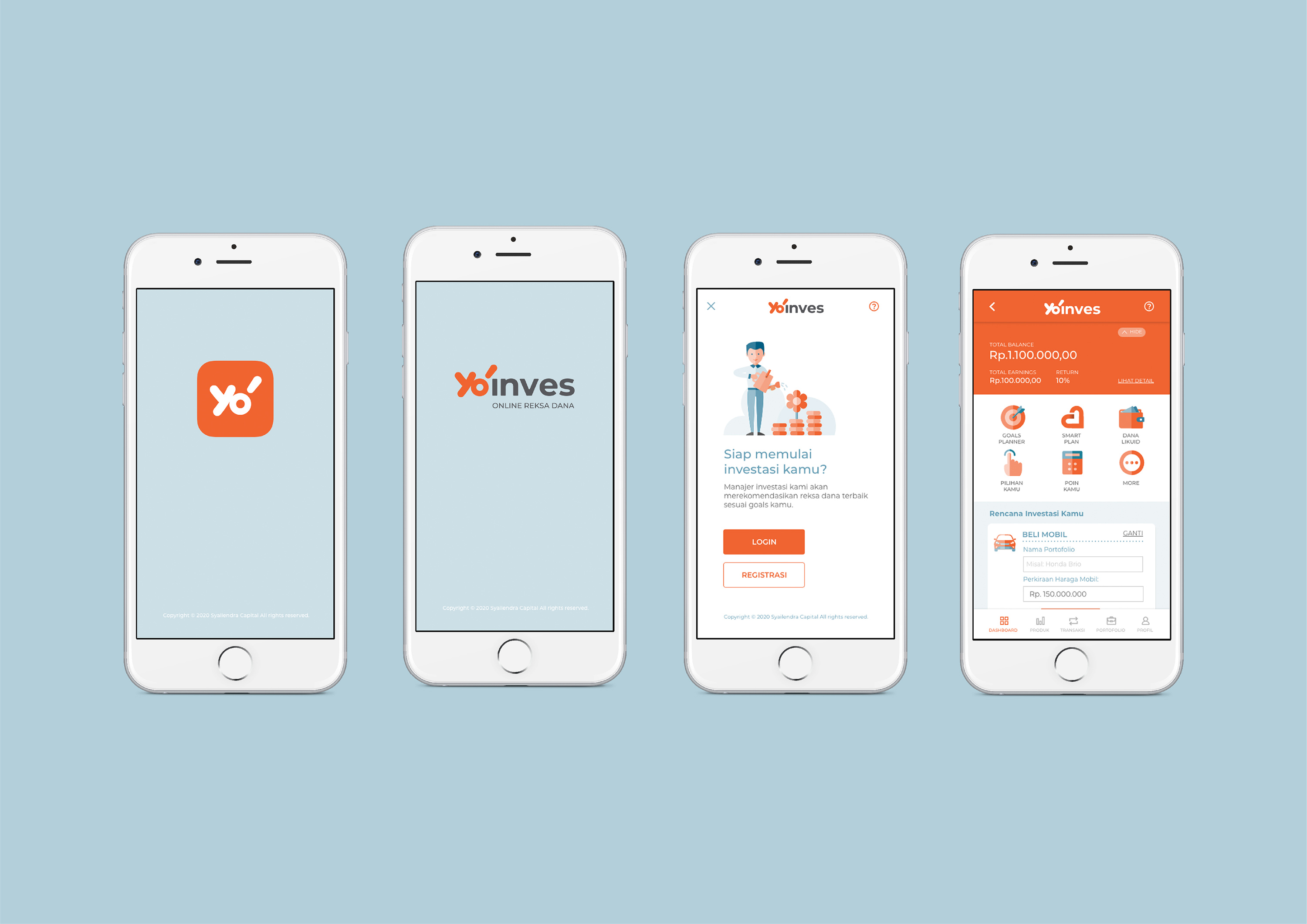
A User-Centric Approach
The Yo! Invest platform was designed with the user in mind. Our goal was to break down the barriers in the investment world and provide tools and resources that empower users to take control of their financial futures.
Making a Bold Statement
The visual strategy for Yo! Invest was all about making a bold statement. Our design elements were aligned with the brand's dynamic and forward-thinking philosophy, ensuring a memorable and engaging user experience.